In This Article
Follow BestForAndroid

- Claude can now generate interactive charts, diagrams, and visualizations directly inside chat conversations, no code required
- Uses JavaScript, Chart.js, HTML, and SVG to create dynamic mini-apps with sliders, buttons, and interactive controls
- Available to all users, including the free tier, rolled out this week as a beta feature
Anthropic added interactive visualization capabilities to Claude this week, and you can now create charts and diagrams in a matter of seconds, something that would have taken you 30 minutes to achieve in Excel.
Beginning today, you can ask Claude to explain a concept or analyze data, and it can now respond visually with interactive charts, diagrams, and visualizations rendered inline as part of the conversation. These aren’t static images or screenshots; Claude generates interactive HTML and SVG elements that load faster than images and support hover and click interactions.
Ask about compound interest? Claude builds a calculator with sliders. Want to understand the periodic table? You get a clickable version you can explore element by element.
Claude, on its own, decides when a visual element would help, though you can also prompt it directly with requests like “draw this as a diagram” or “visualize how this might change over time,” and the result will blow your mind.
The Technical Implementation
Claude writes JavaScript code using Chart.js visualization libraries and then uses HTML and CSS to create temporary mini-apps. The visuals rely on HTML and SVG formats, so they load faster than generated images; they are capable of scaling across varying screen sizes and remain fully interactive.
To see the responsiveness, you can hover over chart elements or click through options. The visuals are dynamic and context-aware.
As you continue the conversation or provide new information to the chatbot, it will modify or regenerate visuals to reflect updated context. This completely transforms the textual chat from simple Q&A into an interactive analysis environment.
How OpenAI Has Implemented Similar Visualization
OpenAI launched interactive visual tools inside ChatGPT a few days ago, which are capable of covering more than 70 math and science concepts with adjustable sliders. Claude’s launch of interactive visualizations came three days later.
I think the timing reflects competitive pressure. Both companies appear to view interactive visuals as necessary features rather than differentiators. When OpenAI ships features, Anthropic moves to match them quickly. However, the implementation is what makes the whole lot of difference.
According to Business Insider, Claude has managed to secure the No. 1 spot among free apps on the U.S. Apple App Store following the recent Pentagon dispute involving OpenAI. And on the other hand, it is one of the top free apps on the Google Play Store. This gives Anthropic a larger audience and greater exposure for new features as they launch visualization capabilities.
Practical Usage of the Latest Visualization Capabilities
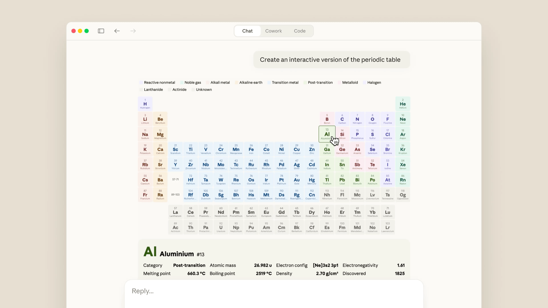
For students, they can generate interactive learning tools like periodic tables or step-by-step diagrams for any concept, which will help them learn, understand, and even memorize it in a better way possible.
For businesses, they now have a handy tool that is capable of presenting any complex information visually, making it simpler and easier to understand. For instance, displaying daily revenue data or something as time-consuming as comparing job applicant resumes.
When it comes to visualization, Claude can generate bar charts, line graphs, flowcharts, system diagrams, structured tables, and data visualizations along with text without requiring any separate tool.
Ask about building weight distribution and get architectural diagrams. Need sales trend analysis? Interactive charts appear inline.
Moreover, generated visualizations can interact with external platforms like Figma, Canva, and Slack, extending functionality beyond chat into workflow tools.
The Verdict
Anthropic emphasizes this isn’t image generation, as Claude uses HTML code and XML vector graphics when producing visualizations. The distinction matters because image generators can hallucinate details, while code-generated charts reflect actual data structures.
Interestingly, this new feature is available to all Claude users, including those on the free tier. This makes interactive visualization accessible without subscription requirements. I suspect this could be a strategic move as they may introduce you to the visual capabilities on the free tier, then encourage upgrades to access other premium features linked to it.
The competitive landscape for AI assistants continues shifting. Text generation is now standard. Image generation is widely available. Interactive visualizations appear to be the current focus for Claude and ChatGPT.
Claude’s interactive visualization feature is rolling out now to all users in beta. Desktop only initially, with mobile support coming later.


